

Architecting Design Systems for Human Perception
From art theory to code: cognitive framing that boosts discoverability, consistency, and delivery velocity.

Hi, I’m Rob. This is a free issue of UI Engineering Excellence. I write for Frontend Engineers and Product Developers on how to be the best at building apps that win in the market. Subscribe if this is useful. Paid readers get early looks and occasional behind‑the‑scenes notes:
Back in 1993, Donald Norman coined ‘user experience’ to remind us that emotions, behavior, and satisfaction should steer product decisions.
Design tokens- simple name‑value pairs for colors, type, spacing, and more- let us compose those experiences in code.
A clear token hierarchy allows for flexible theming and gives design and engineering a ubiquitous visual language.
One common approach bundles lower‑level options into higher‑level decisions. Many teams split tokens into three or four layers to keep things organized.
“How to convey the idea that, when designing a product, we’re not just assembling blocks… But we also want our user to feel something.”
— Audrey Hacq, Atomic Design & creativity
The Problem: Design systems treat tokens as subatomic design particles, ignoring human perception.
That misses the point by a mile.
Since we preach user experience, you'd expect these models to mirror how our minds work. Yet no framework nudges you to consider the user at every layer.
In this post, I’ll introduce a slight paradigm shift by mapping tokens with how our brains perceive digital interfaces.
The result isn’t an entirely novel token architecture but an evolution of existing 3-tier and 4-tier models into an experience‑first framework.
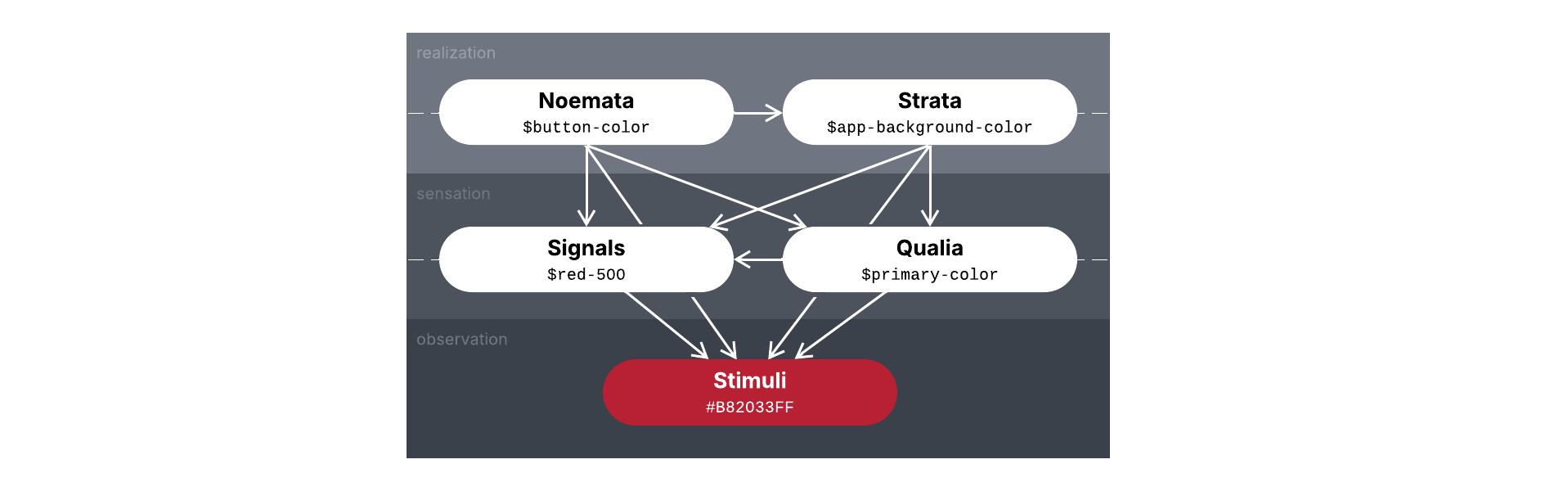
The model has four main layers of abstraction for tokens, each serving a distinct purpose:
Signals: Simple tokens that transmit discrete design information.
Qualia: Composite tokens representing instances of subjective consciousness.
Noemata: Component tokens as repeatable attributes of an experience.
Strata: Theme tokens for the manifold horizon in which experiences occur.
Each layer corresponds to a stage in the chain from raw design stimulus to experienced interface all within the framework of the user’s perspective, mirroring the progression from observation to sensation to realization.
We’ll go over these layers in more detail further down, describing their role and how they relate to both implementation and perception, with examples of what tokens in that layer look like.
To get the most out of it, we first need to understand how design tokens and the methods we use to create them are built on prior explorations of human perception as forms of art.
Why Perception Matters
It’s already there, implicitly.
Design is as much about psychology as it is aesthetics. A $primary-color draws user attention, a $spacing-L suggests a comfortable margin, and so on.
When we tune color scales using harmonious intervals or scale typography with musical precision, we’re guiding the user’s eye in a way that reduces cognitive friction and builds trust.
We’re also ensuring some valuable consistency on our end. If you’ve ever wasted time trying to figure out why --grey-150 exists when every other interval in every hue increments by 100, you know what I mean.
Colors, shapes, typography, and layout all work in concert to form a user's impression within milliseconds.
From Art To Interface
I studied a bit of art history in college for my Graphic Design major and can’t get enough of art movements and the philosophies behind them.
Soon after graduation I discovered Synchromism, a little-known short-lived early 20th-century movement that explored the relationship between color and music.
“Before investigating the analogy of colour intervals it is necessary to emphasise the fact that the psychological equivalent of the simultaneous perception of two or more sounds, is the simultaneous perception of two or more juxtaposed colours. Consequently the analogue of harmony in sound must be sought in juxtaposed colours. Melody in colour will therefore result from the espacement of colours, their isolation by intervening neutral tint, and also from the order in which colours lie on the field of vision.”
— Percival Tudor-Hart, “The Analogy of Sound and Color”, Cambridge Magazine 7, no. 21 (2 March 1918): 485
Synchromism In 30 Seconds
Synchromism was an art movement founded by Stanton Macdonald-Wright and Morgan Russell.
From a desire to create form from color alone, they used musical scales as a framework to build paintings from pure hue relationships (called synchromies), defining “color scales” to orchestrate visual harmony just as a symphony arranges sound.

Pick one hue as your central “note”. Add the third and fifth tones from the color spectrum like a musical chord, placing them in nearby shapes.
Synchromies show waves of colors moving in and out, often converging into a vortex that bursts outward in complex harmonies.
Like a light show without lasers.

Underpinning this methodology is a deep engagement with contemporary color science and music theory.
This rational basis aimed to deliver color that could be “heard” as well as seen.
Influence in Design Systems
Synchromism’s core insight (that harmonious aesthetic relationships can be composed like music) laid a conceptual foundation that guides modern design systems.
Though most prominent in color ramps and type scales, it can just as easily apply to spacing units, motion durations, and more.
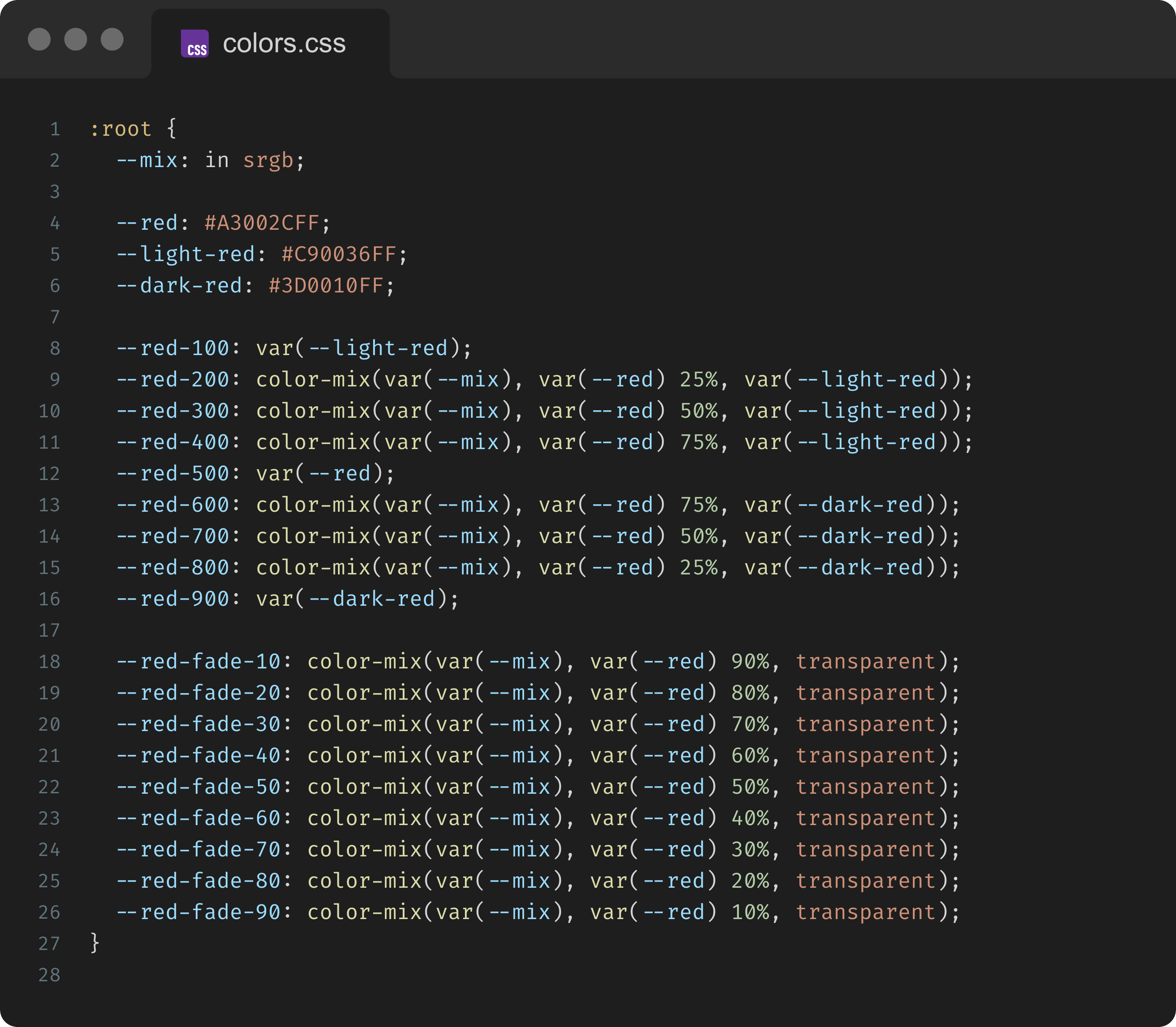
Color Scales
Design systems often use what’s called a nonatonic (9-step) color scale from 100 to 900, with each interval 10% darker. An 18-step version denominated by 50 (5% darker) is octodecatonic.
These darkness intervals act like octaves, keeping each shade in harmony. HSL lightness shifts by a constant geometric ratio, like moving up scale degrees.
The terms nonatonic and octodecatonic come from musical scales and reference a stable central hue or “tonic” that usually sits at 500 or 450 (i.e. the median of the range).
Thankfully we don’t have to do all this by hand anymore, we can do it in CSS directly with color-mix():
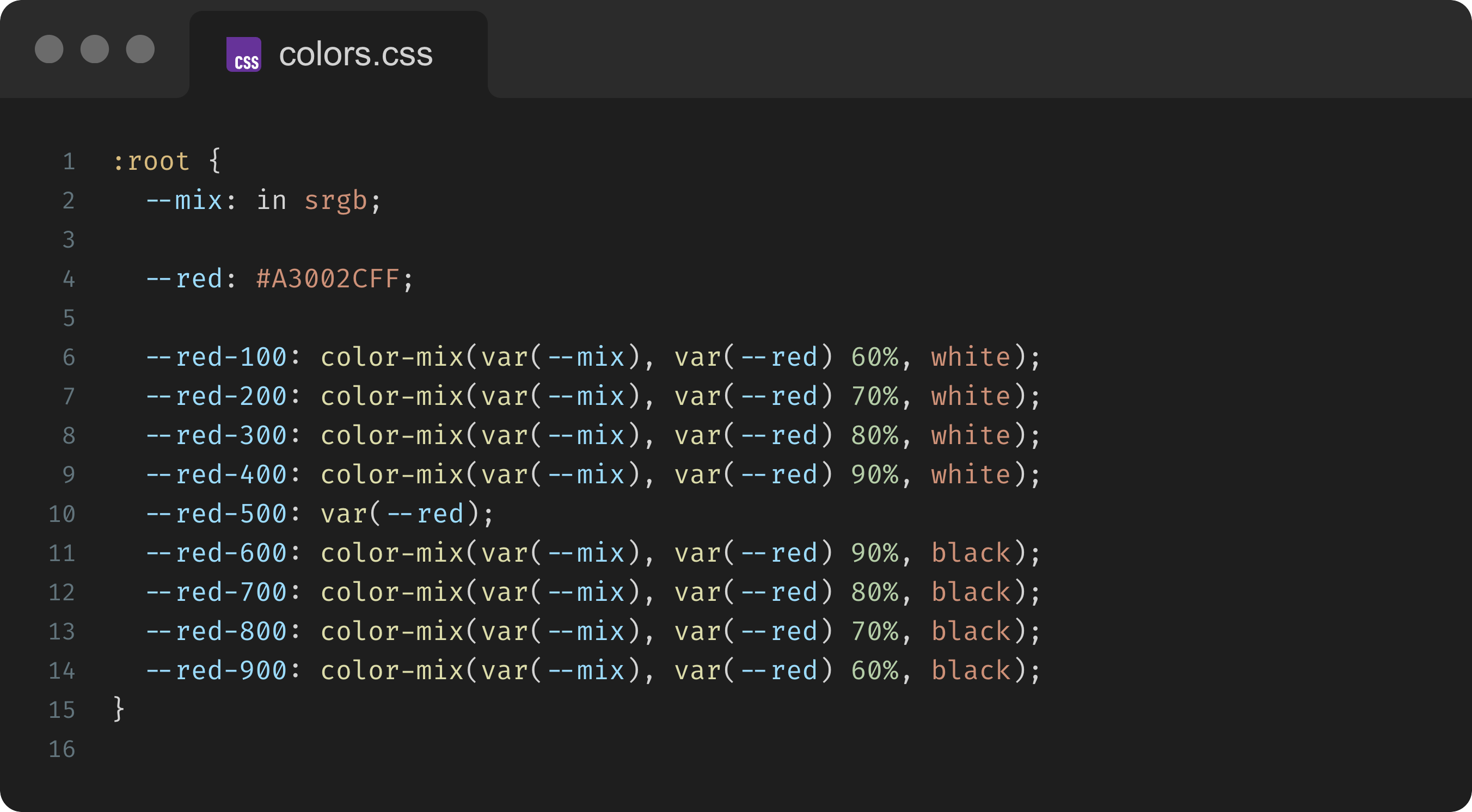
Natural tinting and shading isn’t as simple as the current color mixed with white and black respectively; it often blends in complementary colors and other colors of light around it.
A better approach is to choose a more dynamic range implemented like so:
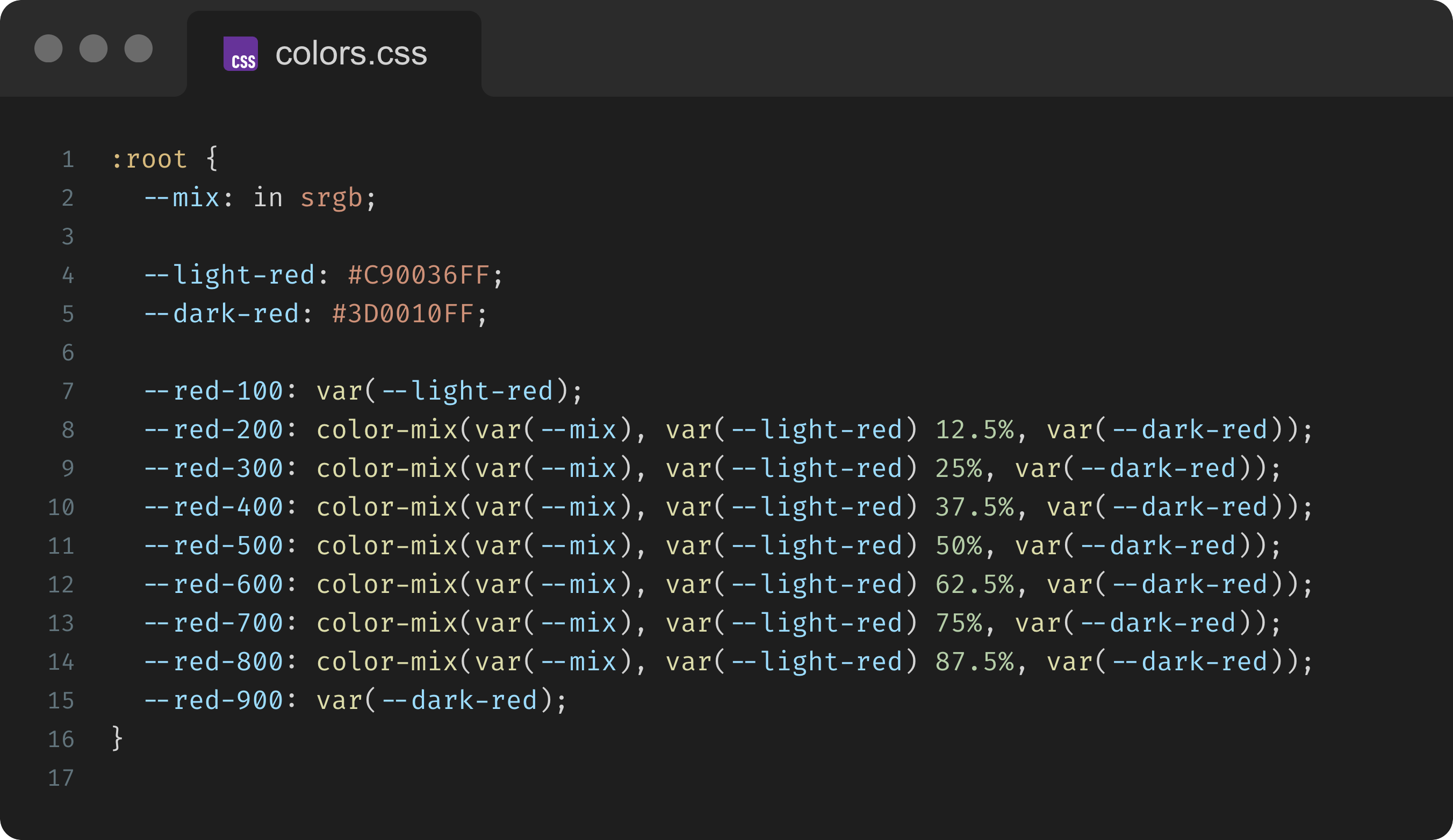
That said, we usually want to keep the tonic for fades:
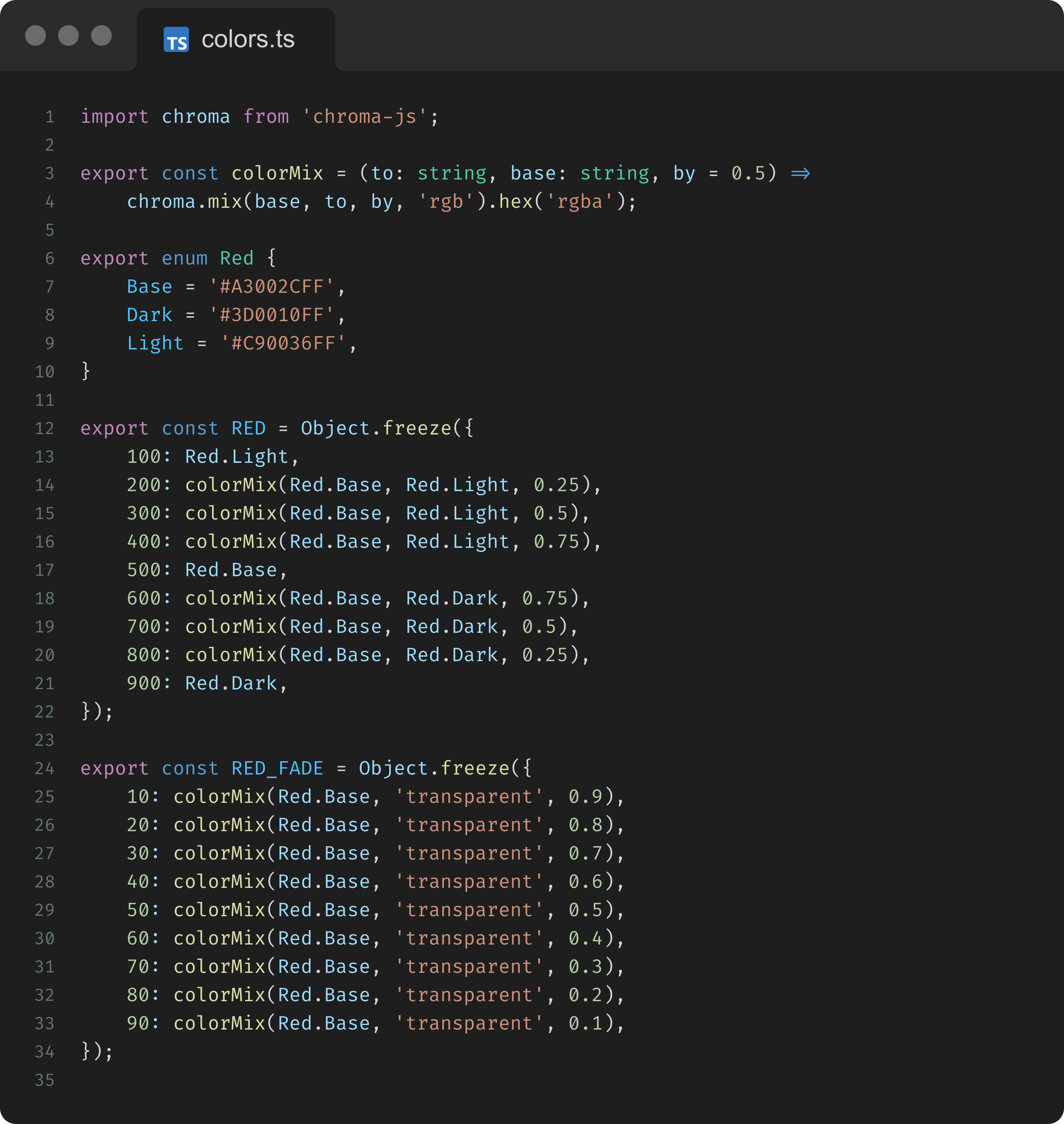
For JavaScript/TypeScript tokens, we can reproduce color-mix() with Chroma.js:
Typographic Scales
If you aren’t already familiar with Spencer Mortensen’s breakdown of typographic scales, give it a read. It’s a classic!
In short, he lays out the following formula for creating harmonious typographic scales:
His rationale is as straightforward as it gets so it’s worth repeat here:
“A typographer chooses sizes from a typographic scale in the same way that a musician chooses notes from a musical scale.
Like a musical scale, a typographic scale is a scale, so it must obey the scaling property: if f is a size in the scale, then rf must also be a size in the scale, where r is the ratio of the scale.”
Guess what? We can do this directly in CSS too!
The following gives us a dodecatonic golden typographic scale (12-step scale where the ratio is the golden ratio):
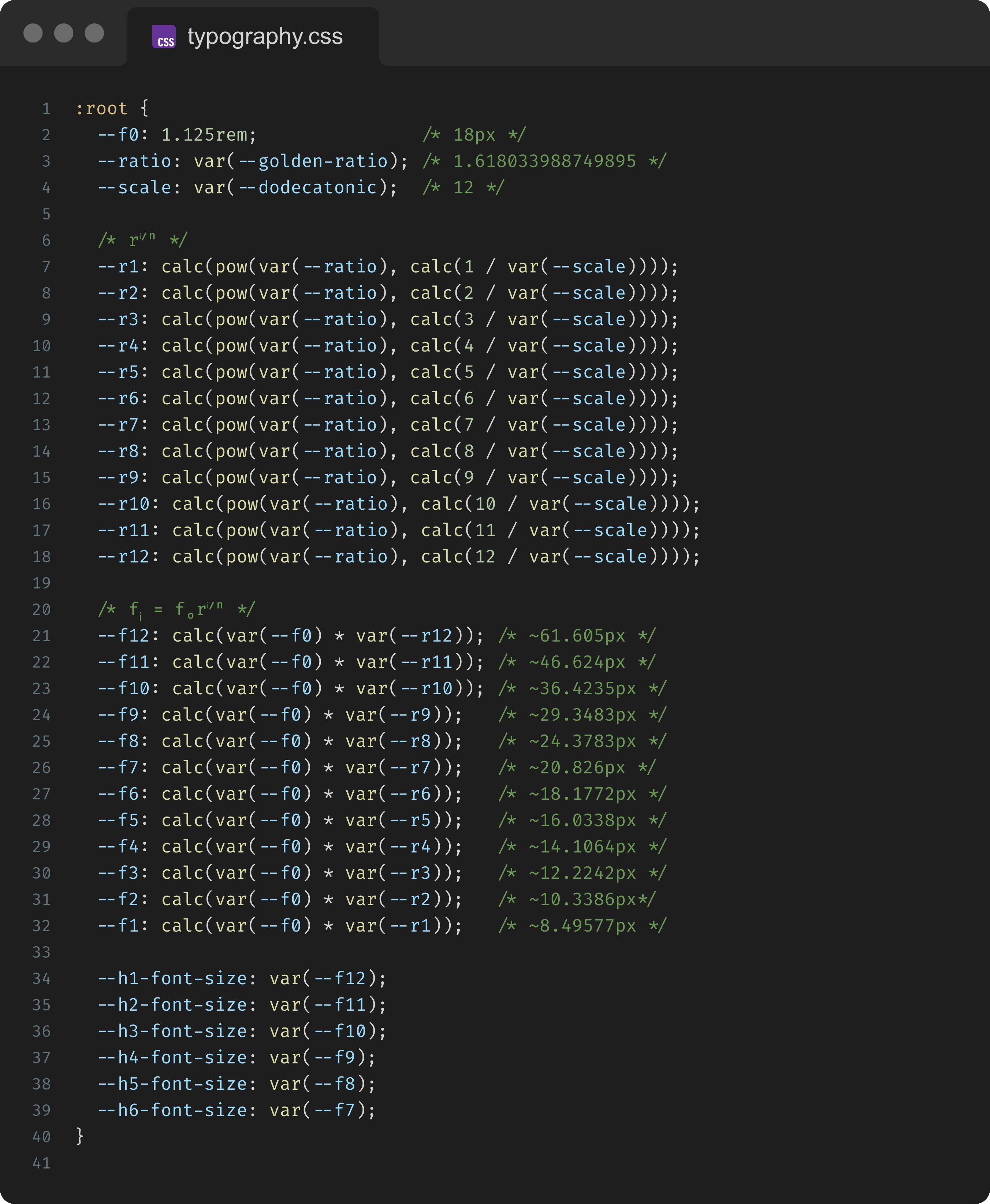
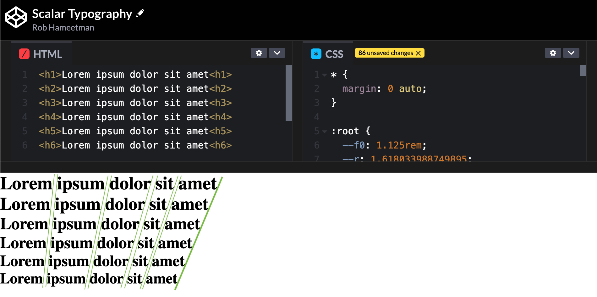
The tonic (f₀) isn’t quite the median here but the scale works the same way.
We can tell by rendering each interval and visualizing an imaginary line at the edge or spaces in between. Notice how the line is curved for User Agent styling:
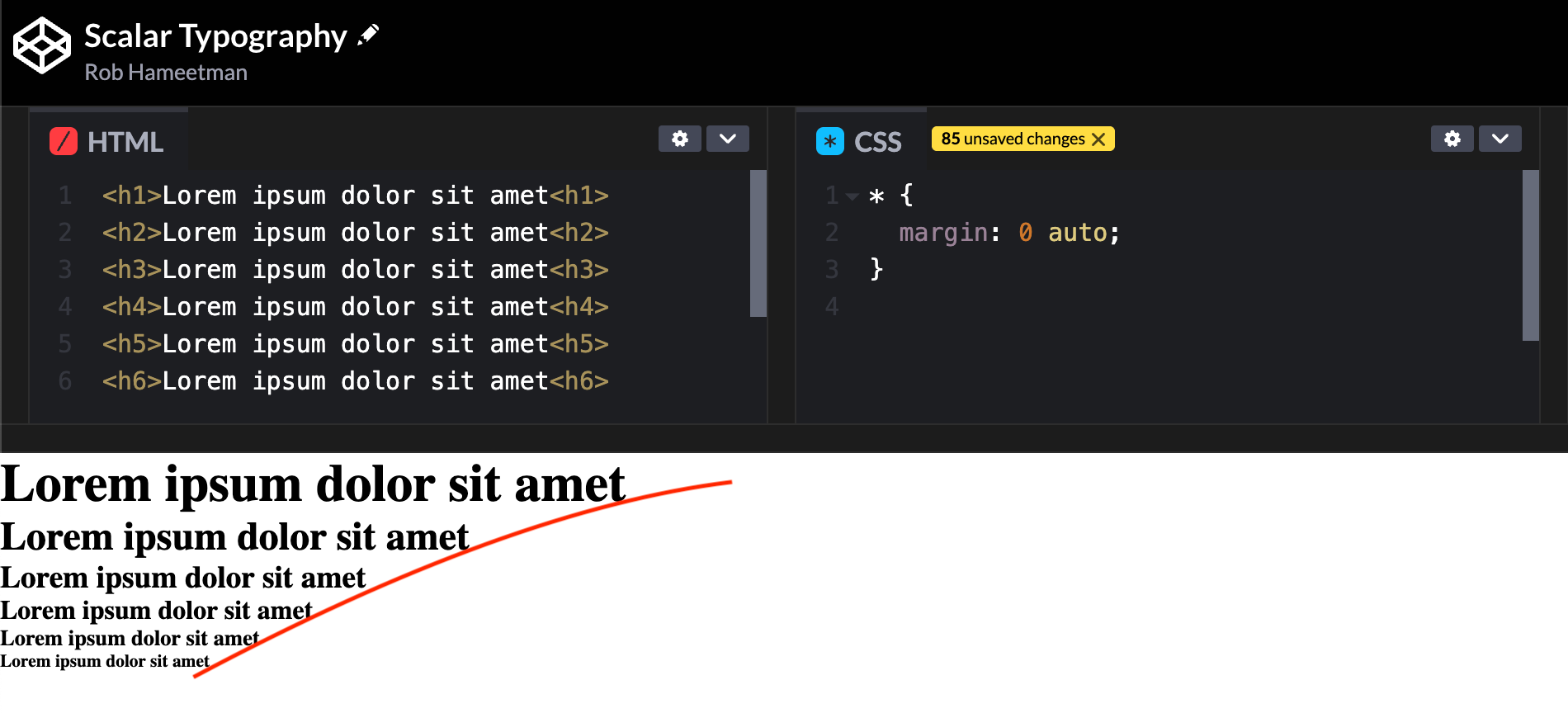
When typography is scalar, the line is straight:
Compositional Tokens
Humans understand the world not by isolating individual elements, but by weaving them together into a coherent context.
In fact, the very word "context" comes from the Latin contextus, meaning "to weave together," highlighting that context is something actively constructed rather than a static backdrop.
Cognitive scientists note that context creation is an active, two-sided process; we continuously integrate cues from the environment and in turn our understanding of the context influences how we perceive those cues.
In other words, context and content shape each other in tandem, much like threads woven into a single fabric. At the neural level, the brain literally binds together features of an environment or experience to create a unique context representation.
Research in memory formation shows that the hippocampus quickly constructs a “conjunctive” representation of the various features of a place or situation.
This bound representation means that even a small subset of those features can later trigger recall of the whole context through pattern completion.
In cognitive terms, what we see or hear is heavily influenced by surrounding cues and our expectations.
The same visual or UI element can feel completely different in a different setting or theme. This underscores why designing for perception means designing for context: the human brain will always interpret interface signals through whatever contextual frame is in place.
Signals
Generally speaking, a signal is a transmission of information from one part of a system to another. In design systems, they provide a finite palette of options from which more complex experiences emerge.
By thinking about them in terms of constraints, we enforce a baseline harmony and limit the design space to a controlled and ubiquitous vocabulary.
Wait- Aren’t Qualia Irreducible?
Philosophically, qualia refer to the subjective, irreducible experience of consciousness.
Whether or not irreducibility is true depends on if subjective consciousness fully emerges from the objective processes of the brain.
Regardless, it’s undoubtedly true that sensory experience involves signals transmitted through the nervous system. Our brains receive and process these signals to construct our perception of the world around us.
Given this, we can make an argument either way such that this paradigm becomes flexible enough for both 3-tier and 4-tier token architectures. In a 3-tier token architecture, signals simply become the most granular qualia.
Constraints
Signal tokens are either discrete raw values or use other signals to compute a new signal.
1 token = 1 value
Examples
Signals should be used whenever you need a concrete value.
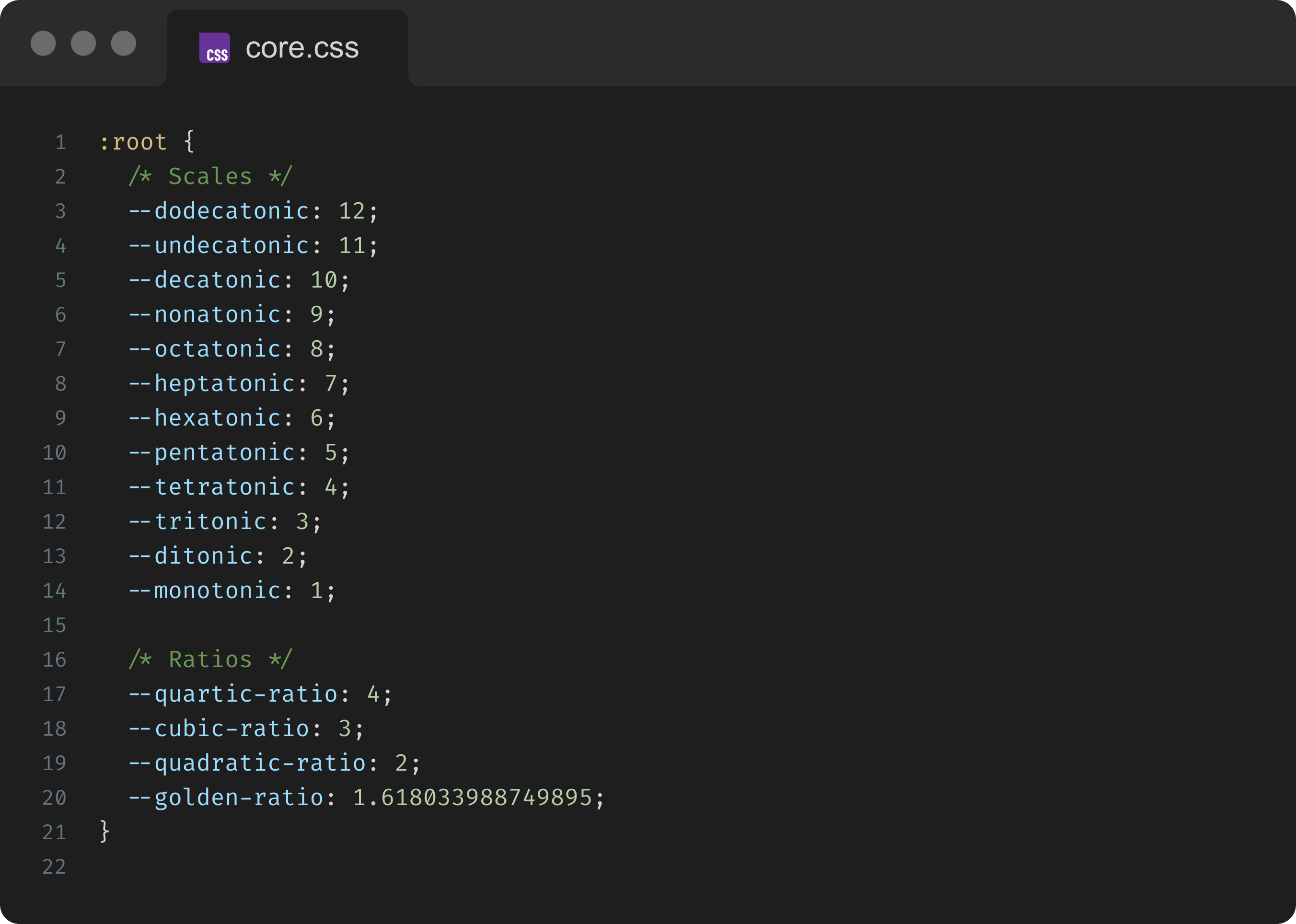
If you plan on computing scalar values for color and typography like we do above, it’s a good idea to have a set of core signals that include some of the terms and ratios mentioned earlier:
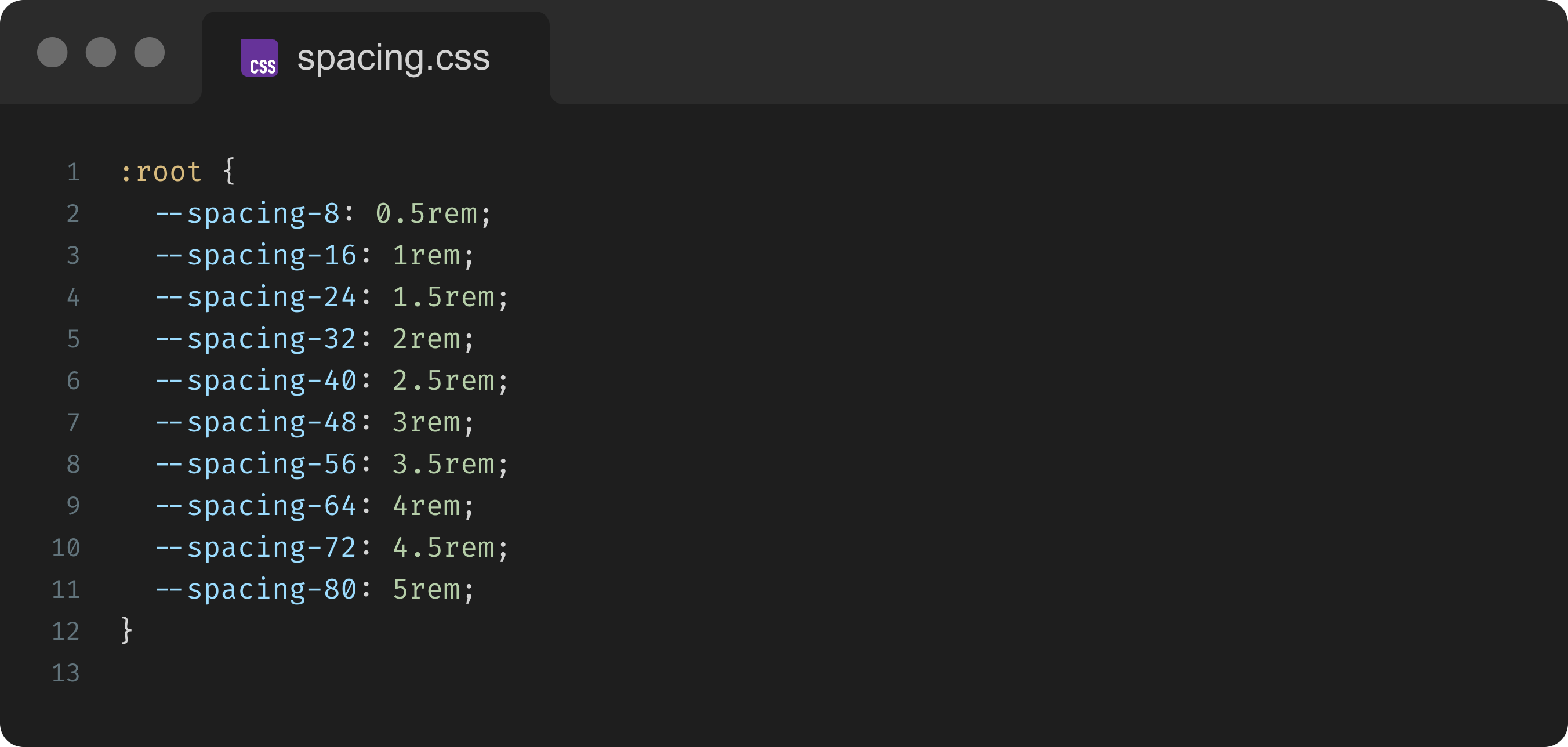
Signals can also be values for other things like breakpoints, spacing, border radii, shadows, and so on:
Naming
Since signals are often part of a scale or compound value, they’re usually named relative to similar signals (e.g. $red-400 vs $red-500 or $dark-red vs $light-red) within the same group. Numbers should provide consistency across intervals:
✅ GOOD:
$red-fade-90,$red-fade-80❌ BAD:$faded-red,$more-faded-red
Qualia
The term qualia (singular: quale, pronounced “kwol-ay”) comes from sense-data theory, referring to the subjective quality of conscious experience as properties of sense-data themselves.
When we see a button on a screen, properties like “red color, 10pt font, 4px radius” are parsed pre-attentively and then combined, almost like a form of sensory data compression.
What we actually experience is the overall look and feel as a prominent call to action.
Make It Make Sense
Imagine trying to describe what it feels like to see the color red to someone born totally blind.
Qualia are these immediate sensations. They capture “what it’s like” to experience a signal with meaningful context.
In reality, we don’t just run into the color red. Rather, we experience the “redness” of something like an apple or a can of Coca-Cola or a button on a screen.
As qualia, the redness of an apple isn’t equivalent to the redness of a can of Coca-Cola even if the two hues are exactly the same.
If signals are ingredients, qualia are flavors. They encourage us to start thinking in terms of low-level sensations rather than objective values.
Constraints
Qualia may use raw values, signals, and other qualia.
They should never use noemata or strata.
Examples
Qualia typically use signals either directly or in composite values to create new tokens with specialized meaning.
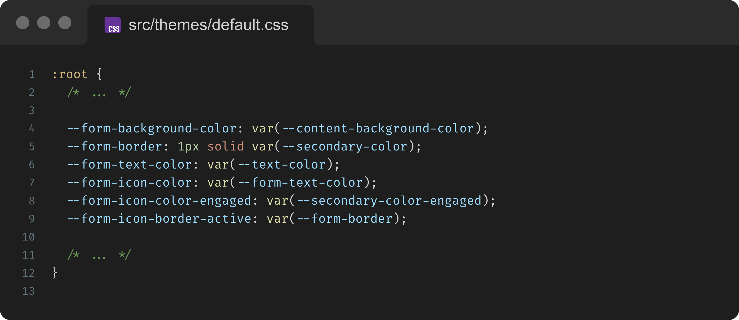
For example, a color scale might have signals for blue like $blue-100 used by qualia like $primary-color or $info-color.
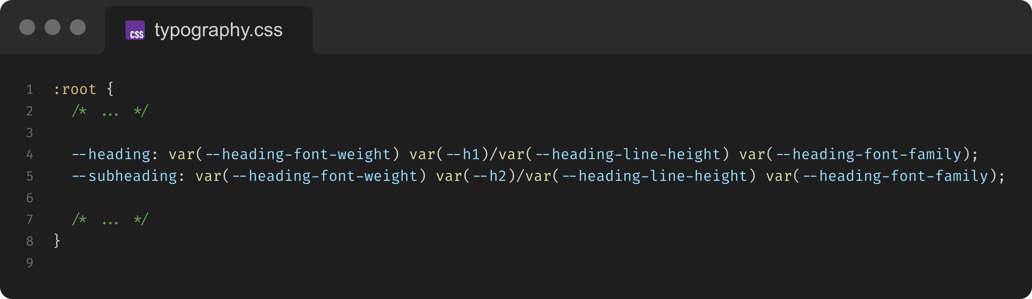
Consider our typographic scale from earlier.
The scalar tokens —-f12, —-f11, —-f10, etc. are signals, while the heading tokens —-h1, —-h2, —-h3, etc. are qualia. Both types are used for font sizes, but the latter have specialized meaning as heading sizes.
These tokens can then compose more complex qualia for the headings as CSS font shorthands:
By packaging decisions in this way, qualia also help reduce errors. Use theme wherever you want to encapsulate a design decision with a purpose.
As a rule of thumb, if a style decision would appear in CSS as a shorthand or a group of properties, it’s a good candidate for a quale token.
Naming
Quale token names should capture meaning or usage. A good practice is to think, “How would I describe this token’s role to a colleague or stakeholder?”
For example, when naming and grouping color qualia, consider the underlying meaning. Words like “primary”, “secondary”, “tertiary” are about priority; system colors indicate intent:
❌ BAD:
$red,$grey
✅ GOOD:$primary-color,$secondary-color
✅ GOOD:$error-color,$disabled-color
Noemata
In phenomenological terms, noemata (singular: noema) refer to the content of thought; essentially, something as it is experienced or intended in the mind.
This ensures that each component’s design supports its function.
Noematic Nuance
Conceptually, noemata overlap with the Platonic idea of eidos, the essence of a thing—it’s “thingness”, if you will.
In programming terms, eidos is like an interface implemented by a class. It’s the mental contract that determines how language shapes reality.
Building on our red apple example from earlier, let’s break down the requirements for some eidetic analysis:
it must be an apple
it must be red (mostly)
The word “mostly” here is the key to understanding the nuance between eidos and noemata.
Say we have two red apples. One has a small spot of discoloration; the other has no perceivable discoloration. Both are red enough to be red apples but you probably think of one as fresher than the other.
In order to account for freshness at the eidos level, we have to increase language specificity from “red apple” to something like “fresh red apple” or “entirely red apple”, which narrows the noematic scope.
If we have two fresh (entirely) red apples, we can still perceive one as fresher than the other but now we need more sensory information like texture, firmness, maybe even aroma or taste.
Both eidos and noemata represent ideal forms. The nuance is that eidos defines what makes a thing that thing while noemata are the repeatable attributes of an experience of that thing.
Constraints
Noemata may use any tokens from any other layer.
In some cases they may also be another noema token.
In rare cases they may be one-off values.
Examples
Use noemata tokens to organize design decisions by component. This way, if a particular component needs to be reskinned or adjusted, you can tweak its tokens without affecting others.
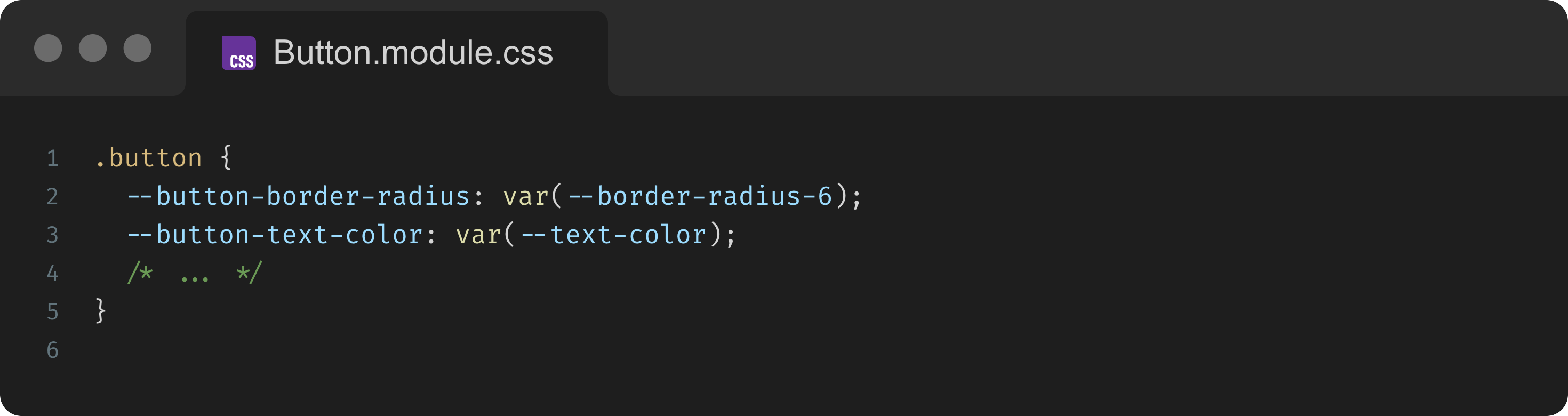
Noemata sometimes reference other noemata when it makes sense, though this usually happens intramodularly:
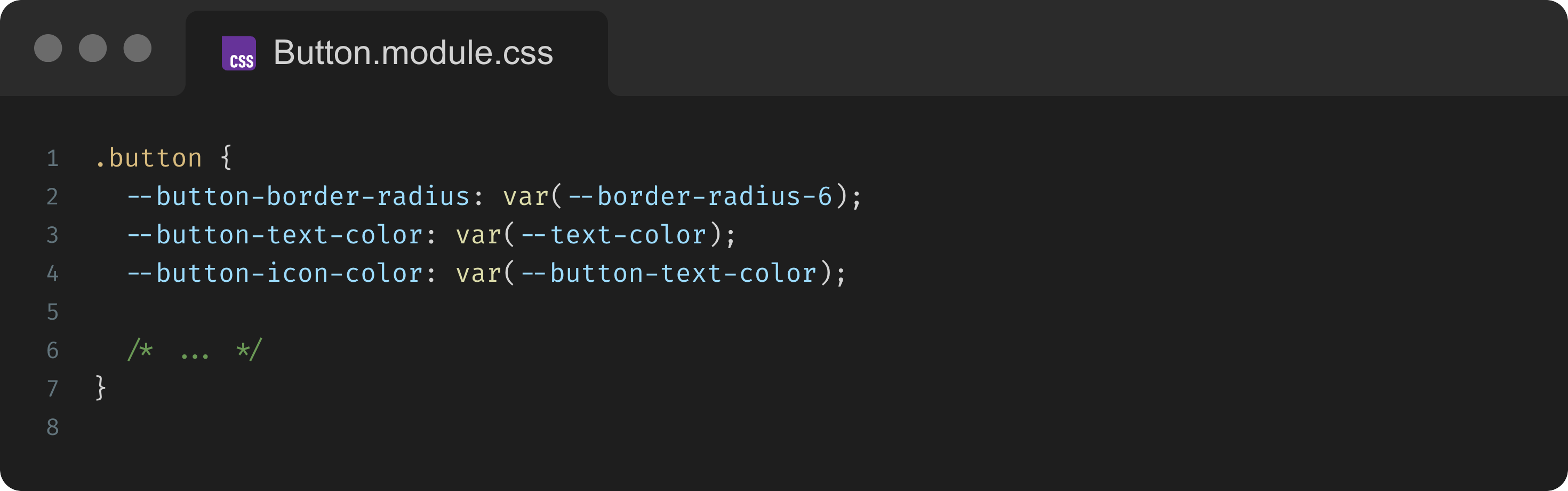
From time to time, it may be appropriate to reference noemata from other components:
Naming
Noema token names usually prefix the component or pattern name to group them:
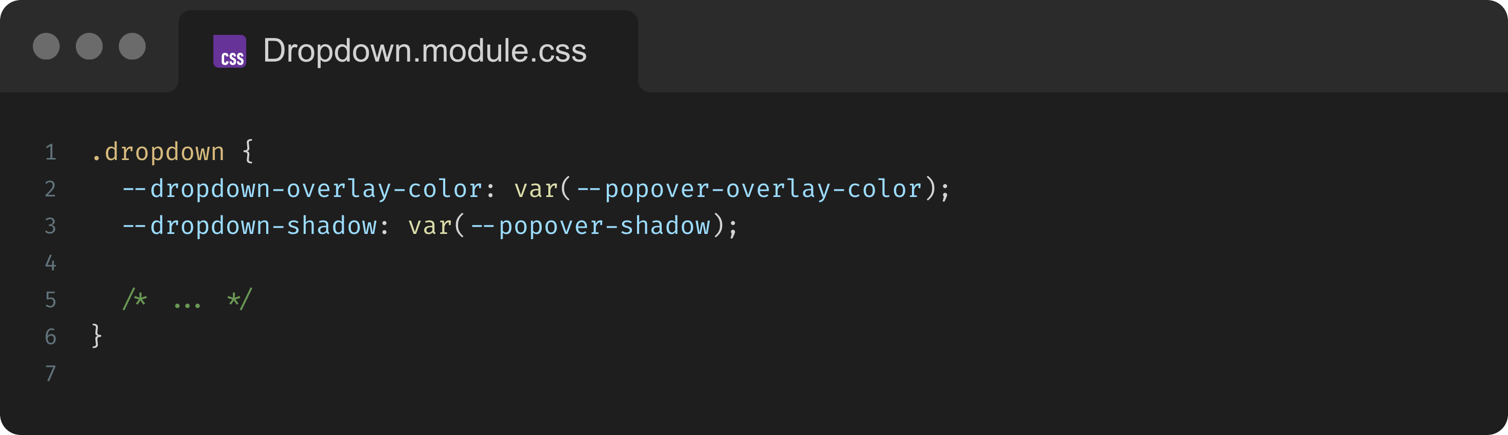
❌ BAD:
$color-background-dropdown
✅ GOOD:$dropdown-color
This way, anyone looking at the token name knows which component it belongs to and what aspect it controls.
It’s also helpful to mirror the component’s parts/states in the token names. When it comes to buttons and links specifically, we recommend the term “engaged” when pressed and hover states overlap instead of words like “active”. :active is a CSS pseudo-class and misusing this term can cause confusion.
By naming noemata tokens clearly, we capture the nuance of each component’s design in a way that is immediately understandable.
Strata
The contextual background or frame in which the user’s experience occurs is called their horizon.
A horizon links past experiences together and, in those connections, guides which new ones join the series. Those links then shape our overarching sense of reality.
The user’s horizon includes not just what is explicitly present in the viewport, but also the implied possibilities and potential experiences. The interstitial links of these experiences are the theme.
A theme is essentially a configuration.
Strata (singular: stratum), therefore, are the layers that configure the user’s horizon of experience.
Constraints
Strata may use qualia and signal tokens.
They may also reference another stratum token.
They should never use noemata.
In rare cases they may be one-off values.
Examples
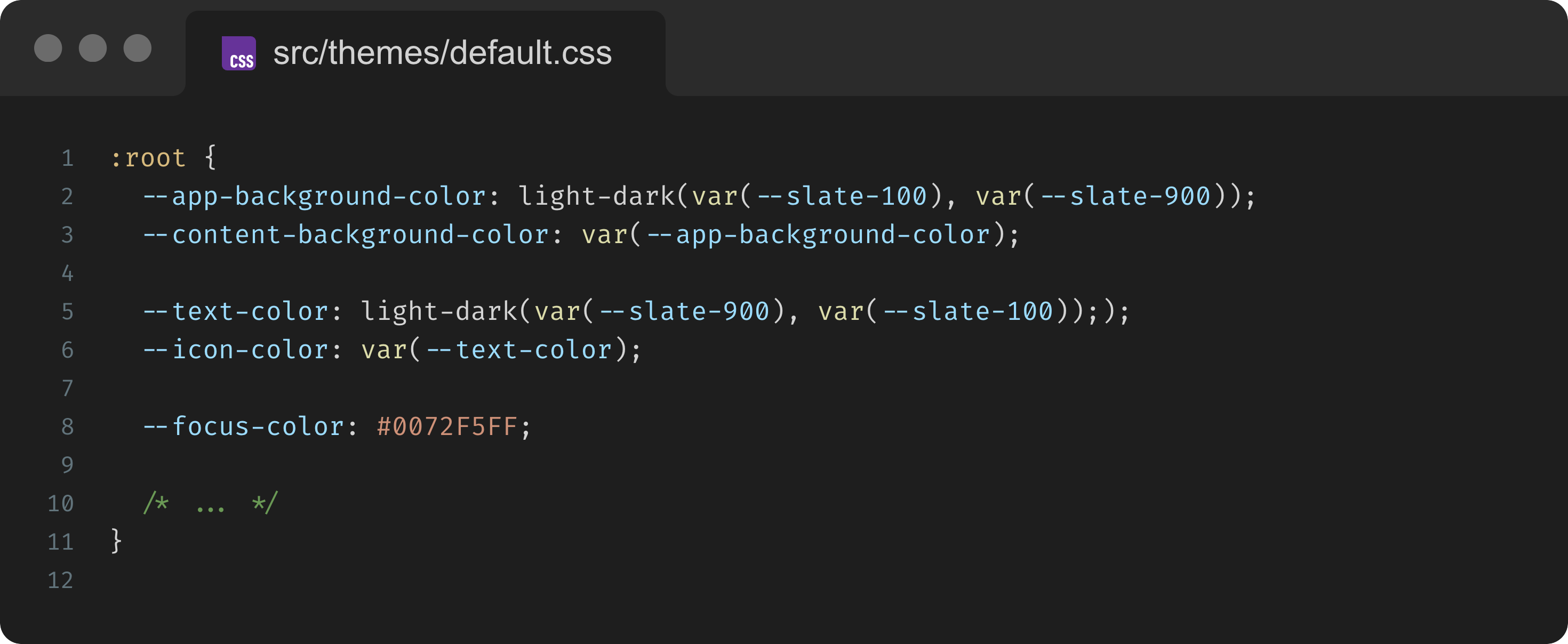
Use strata to enable theming at scale.
While strata could be limited to specific pages or views, a good rule of thumb is to keep these tokens relevant to design elements used anywhere in the app:
They can also encapsulate categories of components:
As strata these tokens tell us that the system doesn’t have <Form> component; if it does, they become noemata.
Naming
Strata shouldn’t “know” the theme they’re in, meaning names should be theme-agnostic.
❌ BAD:
$theme-brand-text-color
✅ GOOD:$text-color
Component Categorization
Beyond token architecture, a way to further align design systems with human understanding is to categorize UI components by their executive function.
For consistency, I’m sticking with words that end in “ation” but the taxonomy of executive function itself isn't a strict science. Teams should feel free to modify these categories and use different terms if it better suits their context.
Many UI components can serve multiple purposes, but this approach provides a useful lens for thinking about design intent.
For instance:
Actuation/Activation - Components that cause something to become active or effective, or simply to "turn on":
<Button>/<Button.Group><Checkbox>/<Checkbox.Group><Radio>/<Radio.Group><Toggle>
Adaptation - Components that allow the user experience to change or be changed in accordance with various edge cases:
<Autocomplete><CatchError>/<ErrorBoundary><ErrorPage><Loading><LanguageSelector><Image><NoResults><ThemeSwitcher><Skeleton><Video>
Classification - Components that label, categorize, or filter content:
<Avatar>/<Avatar.Group><Chip>or<Pill><Label><Search><Tag>
Explication - Components that explain or assist user understanding of the interface or content:
<BarChart><GeoChart><Histogram><Popover><Tooltip><TreeMap>
Narration - Components that present content or guide through a temporal flow:
<Fade><ProgressBar><SlideIn>/<SlideOut><Stepper><Timeline>
Organization - Components that bring content together to help users identify information and/or maintain consistency:
<Article><Carousel><Dashboard><Grid><Menu><Pagination><Select>or<Dropdown><Tabs><Table>/<DataGrid>
Orientation - Components that help users navigate across pages and views:
<Breadcrumbs><Footer><Header><NavBar><Sidebar><Sitemap>
Prioritization - Components that highlight or emphasize important information to grab attention:
<Alert><Badge><Banner><Callout><Drawer><Hero><Modal><Notification>/<Toast><Snackbar>
Segmentation - Components that break or structure content into digestible sections:
<Accordion><Box><Card><Divider><List><Item><Page><Section>
On the surface, this approach might not appear to offer much more than traditional affordance-based component classifications. The main advantage of naming groups by the job they do is that conversations align to outcomes instead of surface form (“is this a button or a link?”).
You can plan to “improve actuation clarity across checkout” or “harden adaptation in low-connectivity scenarios,” then ship coordinated changes across multiple components with shared tokens and guidelines.
Specs can state, “This screen uses actuation and prioritization patterns,” which immediately maps to known tokens, behaviors, and even accessibility rules. Designers choose which function; engineers apply the corresponding patterns.
Instrumentation can also roll up by function: activation rate, time-to-orient, attention capture vs. dismissal, etc. Product decisions become “our prioritization patterns underperform on mobile,” not “this one toast is weird.”
Further, components like <ErrorBoundary>, <Image>, <Video>, <Skeleton>, etc. tend to be disregarded by Product as "utilities"; grouping them under Adaptation clarifies their actual value.
Likewise, <Menu> and <List> are both typically considered structural components in most design systems, and Product Developers often don’t understand the difference. This approach clarifies that a <List> is a method of segmentation while a <Menu> is more about organization.
The goal is to encourage thinking about why a component exists and to organize your library in a way that reflects those purposes. This can help ensure coverage and guide designers on what component to use for a given problem.
Final Thoughts
Embracing the construction of human perception as a guiding concept leads to a token architecture that is flexible, scalable, and truly user-centric.
By mirroring how humans construct and perceive contexts through meaningful combinations and nuanced variations, we create scalable design systems that feel naturally adaptive.
The user’s experience will be distinct where it matters, yet comfortably familiar underneath, because we’ve engineered our tokens the way the mind itself works: composing new experiences out of well-understood pieces, artfully woven together.

Up Next
![[WIP] Accessible SVG Icons The Right Way](https://substackcdn.com/image/fetch/$s_!f4LD!,w_140,h_140,c_fill,f_webp,q_auto:good,fl_progressive:steep,g_auto/https%3A%2F%2Fsubstack-post-media.s3.amazonaws.com%2Fpublic%2Fimages%2Fc54b3810-d9fa-4986-9775-77008fb03c90_2464x1856.webp)
![[WIP] Building a Pit of Success with Inductive Reasoning](https://substackcdn.com/image/fetch/$s_!v3zD!,w_140,h_140,c_fill,f_webp,q_auto:good,fl_progressive:steep,g_auto/https%3A%2F%2Fsubstack-post-media.s3.amazonaws.com%2Fpublic%2Fimages%2F818fc660-922d-4795-992a-dfaeefa0d752_2464x1856.webp)
![[WIP] Mode-Aware Tokens with OKLCH](https://substackcdn.com/image/fetch/$s_!NYv-!,w_140,h_140,c_fill,f_webp,q_auto:good,fl_progressive:steep,g_auto/https%3A%2F%2Fsubstack-post-media.s3.amazonaws.com%2Fpublic%2Fimages%2F55ac3ddc-ddc7-4527-843b-20f73583d2a2_2464x1856.webp)
Any thoughts on what else you’d like to see? Leave a comment or hop into chat and let me know!